|
For this last unit in graphic design class this year, we were assigned to design three logos with varying color/shapes and pick out a favorite. The creation process of the logos I designed actually wasn't too complex. I first figured out a creative way to use ellipses and rectangles and make them represent the letters of my nickname. Then I put a border around the words in a shape that resembled a pig. Then I took the design and made some changes in color and shape; ending up with three different designs of their own unique feature. Although most things worked out pretty smoothly, designing the letters and making them fit each other took a bit more time and effort. Trying out different ways and discovering new features on Gravit helped overcome this problem. 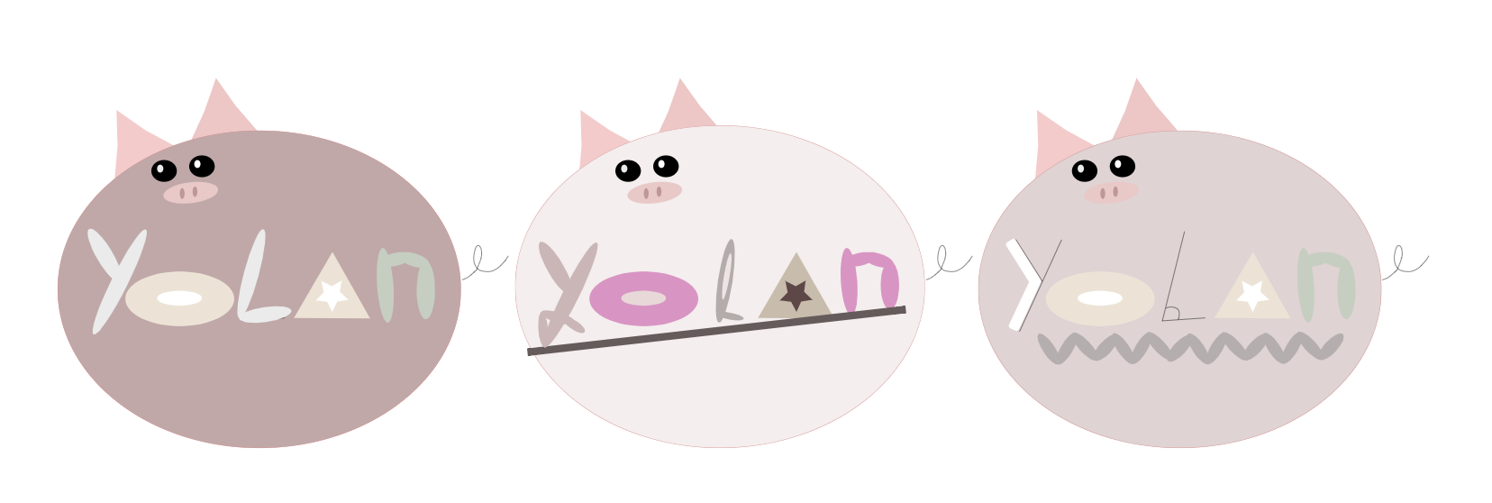 I designed the logos this way because I thought the features included in this design was what really represented me the best. "Yolan" is a nickname that some of my friends call me by, and I thought it would turn out pretty neatly if I actually made it into a logo. The reason why I chose a pig as the border was because I was born in the year of the pig, and I've always thought that it somewhat represented me pretty accurately. The middle design with the lighter shade of pink is my personal favorite because I think the color contrasts and the overall look seems the best out of the three. 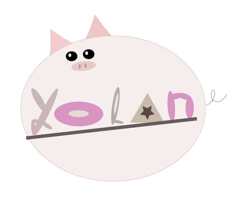
0 Comments
Leave a Reply. |
Archives
April 2021
Categories
All
 This work is licensed under a Creative Commons Attribution-NonCommercial-ShareAlike 4.0 International License. |
