|
Typography is basically the art of arranging text in a way that is pleasant and appealing for the readers. It is extremely important because not only is it easier for the readers to look at, but it can also affect the meaning of a whole section of text. Therefore, it is equally important to choose the correct font, size, and spacing to create the perfect pleasant design you'd want it to be. Adding onto this, the quote "Each font has a personality and a purpose," means that there is a purpose for choosing each font. The size, style, spacing, and many other factors can affect the meaning of a certain text in a different way, therefore it is always important be careful and precise when working with these different fonts. Serif - a small line/stroke is attached to the ends of the letter; usually used in articles, newspapers, etc. Sans Serif - opposite of serif, smooth with no particular projection or change in direction in the letters; also used a lot in magazines, newspapers, etc. Monospaces - each letter takes up an equal amount of space; frequently used in computer programming and coding Handwritten - looks as if written by hand; often used for invitations/announcements Display - unique, usually eye-catching fonts; usually used for posters and advertisements to catch the audiences' attentions Typeface ComparisonFor this first assignment on comparing fonts, we were to write the same exact word/phrase five times in five different fonts. Below, I wrote the phrase "fish tastes good" five times in five different types of fonts, which includes serif, sans serif, monospace, handwritten, and display. 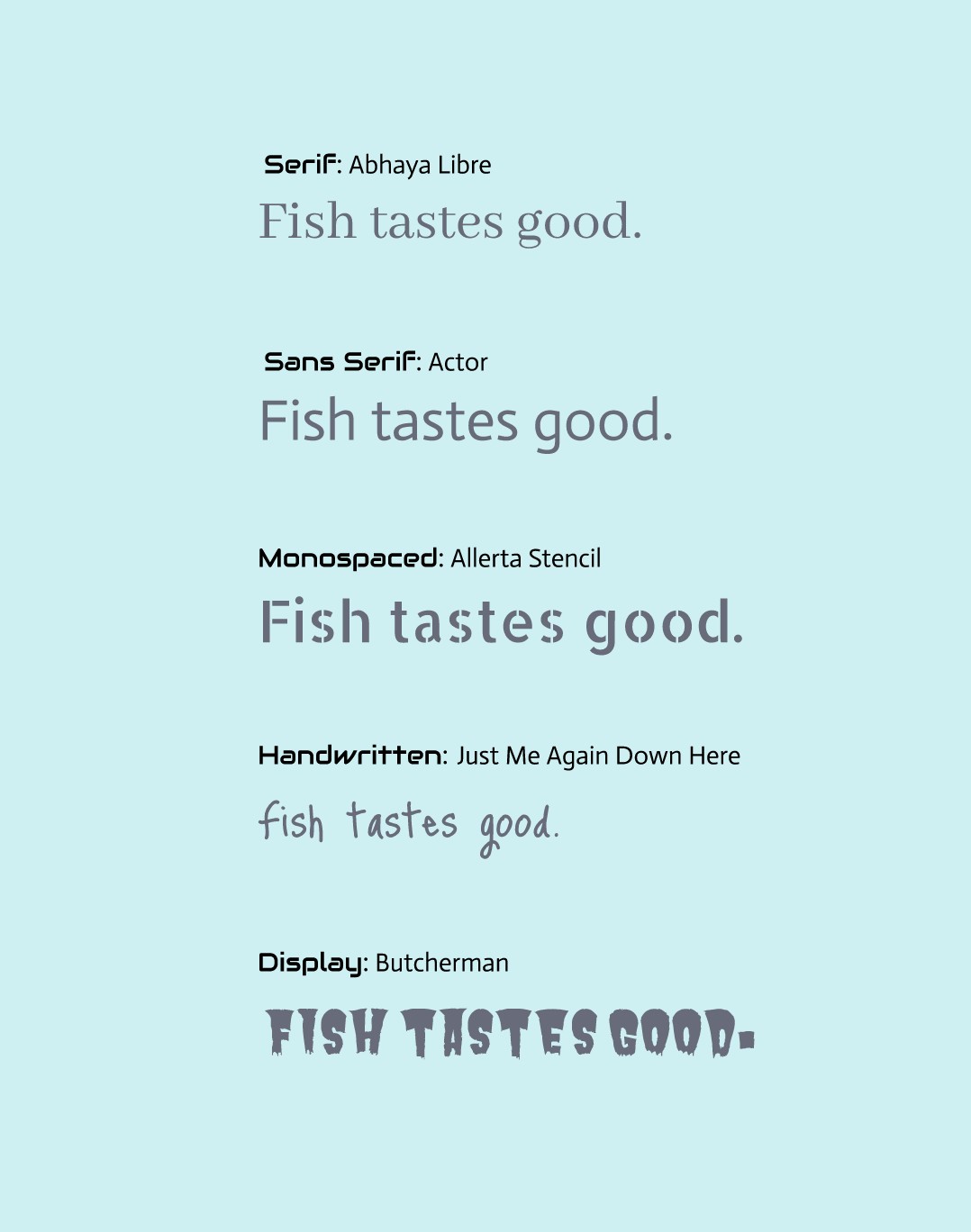 Word PortraitsFor the Word Portraits assignment, we were supposed to find 10 different fonts and come up with a word that matched it, and another word that didn't match it. This assignment clearly shows the importance of choosing the right fonts when doing graphic design. 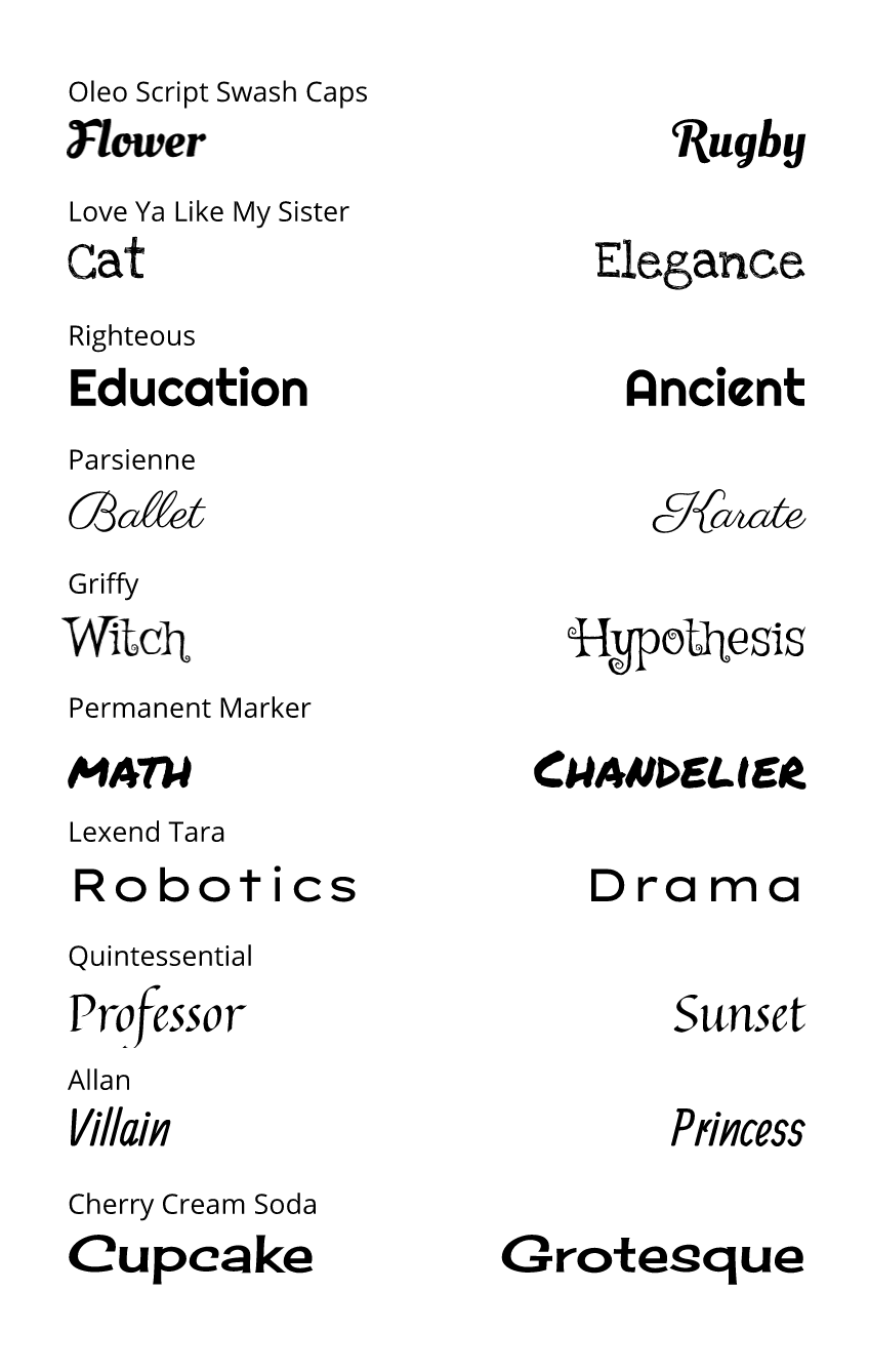
0 Comments
In this unit, we learned how to use the pen tool to create different paths and shapes needed for graphic design. For the first exercise, we traced different shapes/logos by using straight, curved, and cornered lines. The second exercise used what we learned in the first exercise to cut out photos and modify them. The last and most complicated exercise was to use everything we had learned so far to create a composite image as shown below. The Pen Tool is a feature that allows you to create different paths and shapes, and I was able to use this to create my final illustration having to do with three surgeons and a dog. The final composite image was something I came up with after wondering what it would be like if dogs became surgeons. A problem I faced was a part of the image not getting cut out properly, but I soon figured out that it was because I had forgotten to switch from D (sub-select) to V (pointer). I became more cautious about it afterwards. 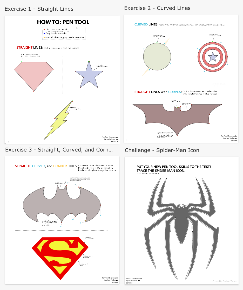  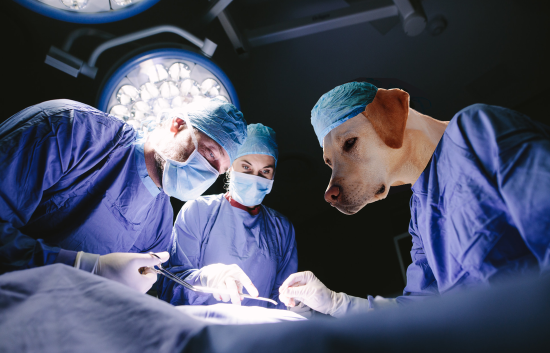 |
Archives
April 2021
Categories
All
 This work is licensed under a Creative Commons Attribution-NonCommercial-ShareAlike 4.0 International License. |
